
Finding the right book can feel like magic when you’re eight years old and standing in front of a library display. One cover grabs you. The title pulls you in. You open to the first page, and the world shifts. But that first connection, the one that happens before a single word gets read, starts with design choices made months before the book hits shelves.
Publishers spend weeks refining covers for middle-grade and young adult titles because visual presentation shapes reading habits. The process draws heavily from creative book design inspiration that spans everything from award-winning children’s literature to experimental graphic novels.
Designers study what works across genres, age groups, and formats—analyzing color psychology, typography trends, and compositional techniques that have proven effective at capturing young readers’ attention.
What Draws Attention on a Bookshelf
Bright colors dominate the lower shelves of any section where elementary readers browse. Typography gets larger, bolder, simpler. Illustrations lean toward expressive characters with big emotions displayed right on their faces.
For slightly older readers, color palettes get moodies: deep blues, burnt oranges, shadowy purples. Hand-lettered titles show up more often. The imagery becomes more symbolic and less literal. A single object might represent the entire narrative: a key, a compass, a torn photograph.
Young readers have learned to read covers the same way they’ve learned to read text. They recognize fantasy before opening the book. They spot contemporary realistic fiction from across the room.
The Role of Visual Identity in Series Recognition
Series books present a different challenge. Publishers need individual titles to stand out while maintaining enough visual continuity that readers recognize the next book in a series they love.
The most successful series establish clear visual rules. Rick Riordan’s various mythology-based series maintain consistent design approaches—bold sans-serif titles, symbolic imagery, specific color families per series. Readers who loved Percy Jackson can spot a new Riordan book without reading a single word on the cover.
This visual consistency builds trust. When they finish one book and want more of that same feeling, the cover becomes a promise. The same design language means the same kind of story, same narrative voice, same emotional experience.
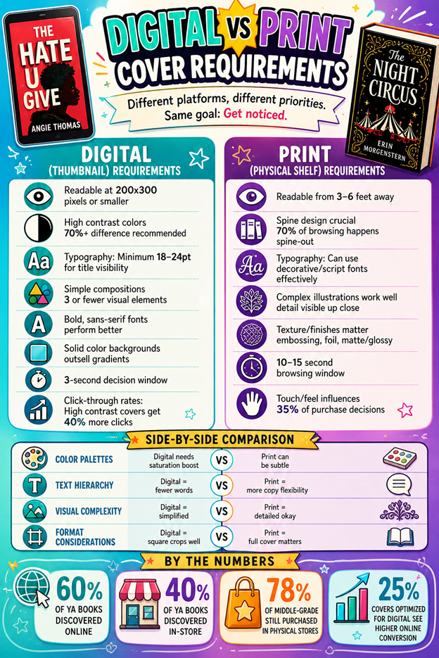
How Digital Browsing Changed Discovery
Online bookstores shifted how covers function. Thumbnails reduce intricate illustrations to muddy squares. Subtle typography disappears at small sizes. Covers that worked beautifully in print became invisible in digital catalogs.
Publishers adapted. Typography got bigger and simpler. Color contrast intensified. Complex illustrations gave way to bold shapes and limited palettes. Good typography directly influences reader mood and engagement with books before they start reading.
Physical browsing allows for serendipity—you spot an interesting spine, pull the book, flip through pages, read the first paragraph. Digital browsing compresses that process. Covers have three seconds to communicate genre, tone, age range, and appeal.
Social Media as a Discovery Engine
Platforms like BookTok and Bookstagram turned covers into content. Young readers photograph their shelves, stack recent purchases, arrange books by color or theme. Books become aesthetic objects that signal taste and identity.
Photogenic covers—those with interesting textures, metallic finishes, or striking color combinations—get shared more often. A book that looks good in a photo gets more organic promotion than one that reads well but photographs poorly. Special editions now include design elements specifically chosen for social media appeal: reversible dust jackets, sprayed edges, embossed details.
Research shows that 40% of readers aged 18-24 display books as interior design objects, a trend that begins in adolescence. Middle-grade readers rarely curate Instagram aesthetics, but their parents do. YA readers participate in book communities online and make purchasing decisions based partly on whether a book will look good in their next post.
What Happens After the Cover Works
The cover’s job ends the moment a reader opens the book. Everything after that depends on the writing, pacing, characters, and whether the story delivers on the visual promise. Mismatches between cover and content damage trust.
Schools and libraries have been instrumental to bridging the gap between books and readers in visual marketing failures. Librarians hand-sell titles, based on discussions with students. Teachers recommend books directly to specific readers.
Schools that encourage a wide range of reading preferences allow students to cultivate larger literary interests than those which initially draw them to. Children learn to go beyond the physical appearance of books, and they find books that they might not have noticed by design.
The most sustainable discovery happens through peer recommendation. When a seventh grader tells three friends about a book they couldn’t put down, those friends find the book regardless of cover design. Word of mouth remains the most powerful force in children’s and YA publishing.
Covers open doors. Stories keep readers inside. Feedback in print displays within bookstores and classrooms is used to determine which books resonate most, creating feedback loops where successful covers inform future design choices.
Publishers analyze this data to refine their approach, but does this design make a young reader want to pick up the book? That question drives every color choice, every font selection, every compositional decision.